WorkFloor 02
The Milligan Foundation
An identity for a foundation working on regeneration beyond buildings. One continuous stroke, made to move.
The brief
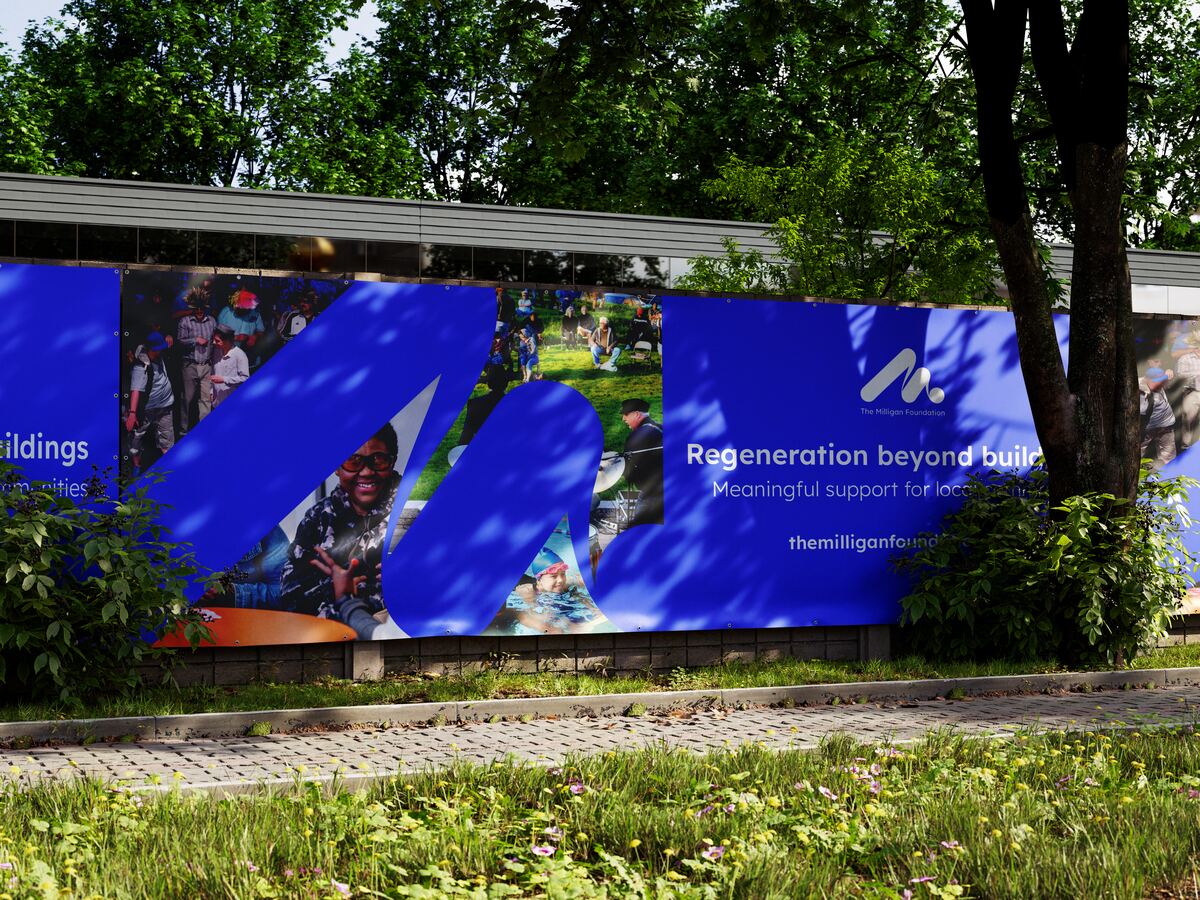
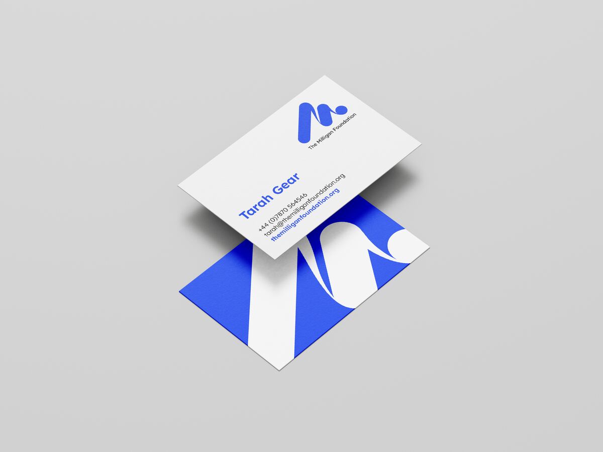
A new foundation needed an identity that felt human and hopeful, and that would hold together everywhere from a site hoarding to a business card.
The idea
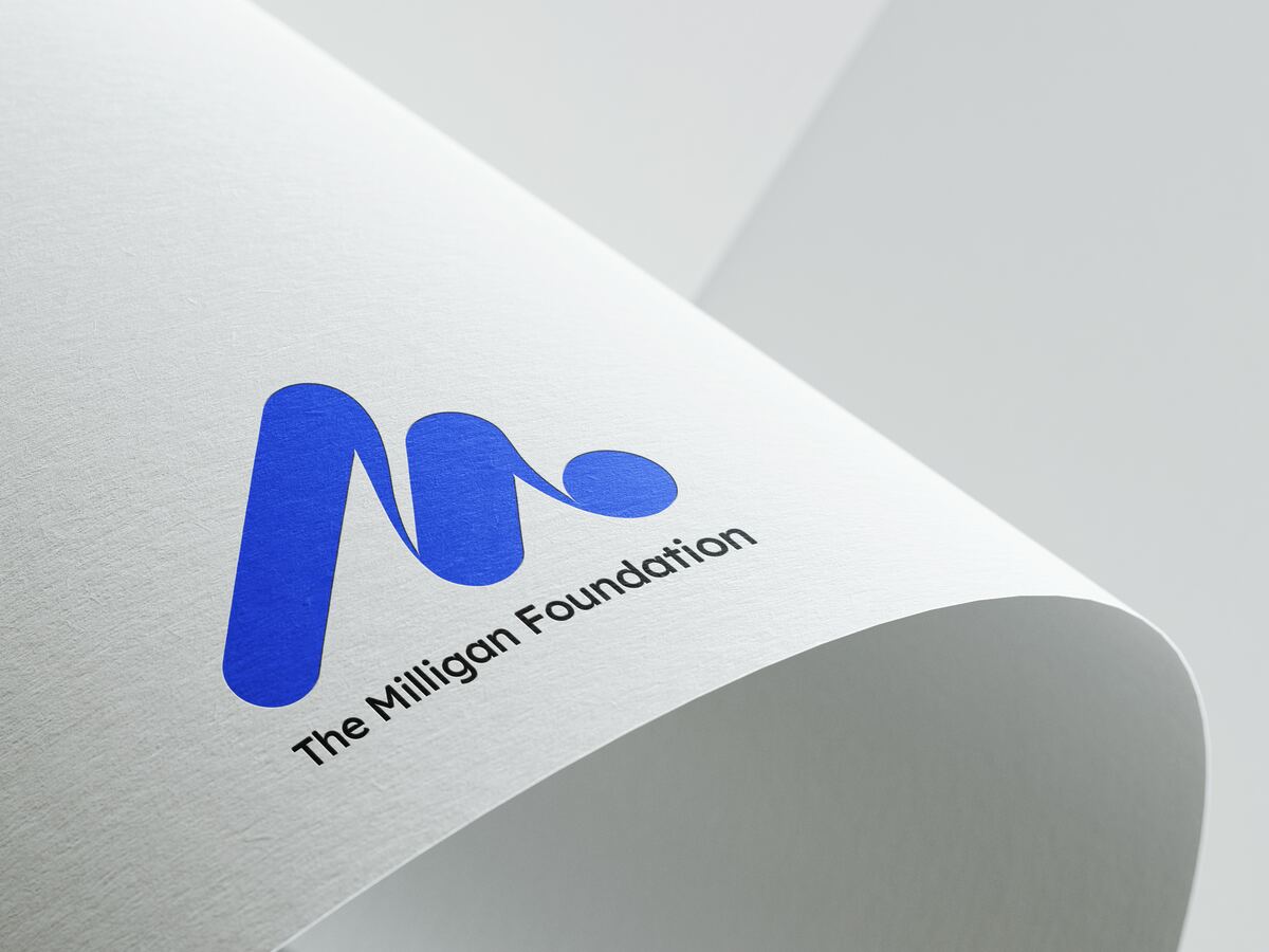
One continuous stroke. The M is drawn the way you would write it: a single movement that rises, turns and lands on a full stop. It reads as momentum, and it works at any size.
The mark
Drawn as it is written.
The outcome
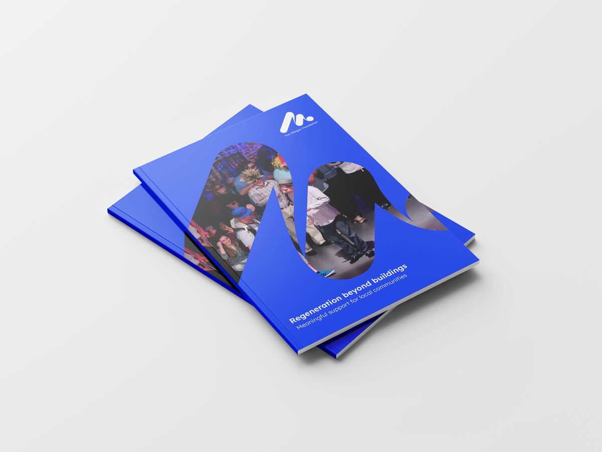
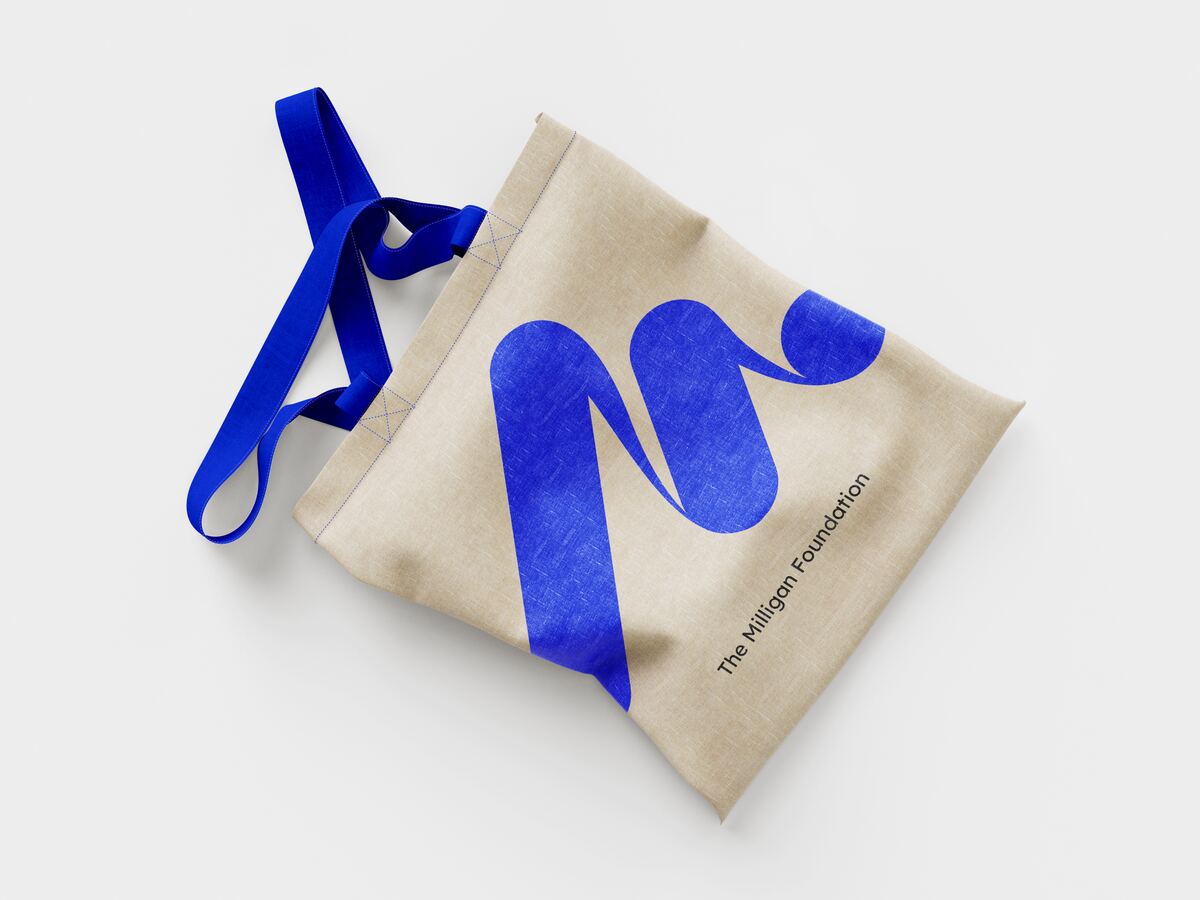
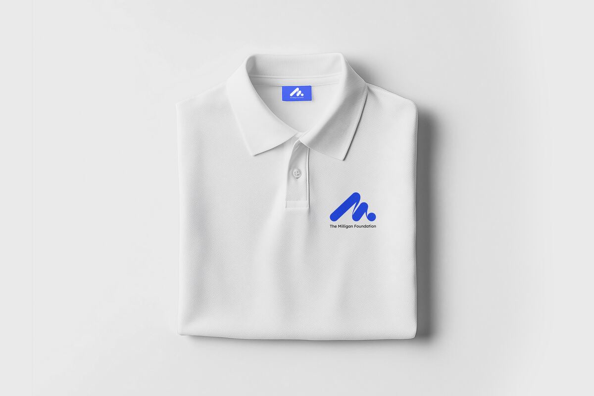
A flexible system across print, hoardings and merchandise, with a mark bold enough to carry photography of the communities the foundation works with.
Bringing our developments and their communities closer together. Our design visualises regeneration as a continuous journey, weaving a shared story through everything we do.
Have a project like this?
Tell us what you
need to achieve.